top of page

Rhiannon Aylward
Media Studies
Design Element Ideas
In order to add more detail to my magazine I am thinking of different design elements that I could use to make the magazine more interesting and different. Design elements are things such as lines, boxes or images that are faded out on pages.
 LinesThroughout my magazine I have added in lines. This is a design element as the lines are not their for any particular reason apart from adding to the design of the page. |  LinesThis is similar to other magazine as lines are frequently used throughout for underlining text or just as added detail |  TextThis design feature is on my contents page in the title where I have incorporated the "O" from Indigo with the "C" from contents. This also looks like the copy right sign even though I originally intended to just have them as overlapping. |
|---|---|---|
 TextOn this magazine they have incorporated an image of a camera lense to take the place of the O. You can still understand what the writing is saying as the camera is the shape of an O. | 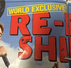 TextThis story however has writing overlapping the other writing. This gives the idea that 'World Exclusive' was stamped on. |  Text BoxOn my double page spreads, I included a text box behind the writing of the name of the magazine to make it more readable to the audience. I have also added an effect to this text box so that it dissolves slowly into the background. |
 Text BoxKerrang! has also done something like this as the contents wouldn't be readable as the font it the same colour as the background. The effect that they have used gives it a mottled kind of look. |  Text BoxI have also added a text box to behind my page number of my double page spread. This is so that it can be clearly seen against the image. |  Text BoxKerrang! have also used this idea for their page numbers as without the black text box the writing would not be seen as the writing and the background are both white. |
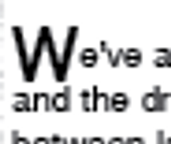 Drop CapsIn my magazine article I have added in a drops caps at the beginning of the article as this grabs the readers attention. |  Drops CapsA drops caps has also been used here including the colours of the page which grabs the audiences attention quickly. |  BoxI have included a white box in which all my article will go onto. I have used this as it is a contrast to the black background and because white is easier to read different colour fonts off of. |
 BoxKerrang! has also incorporated this into their magazines. As you can see they have used a purple background with a white and black lining. |
bottom of page