
Rhiannon Aylward
Media Studies
Magazine Analysis - Kerrang!

General
The Cover


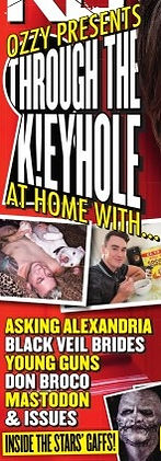


KERRANG! is written in sans-serif font. It has quite a hard font and it is all in capitals. Some of the edges of the title is eroded, although it is still very clear to read.Part of the title is obstructed from sight by an image, however it is still very clear to understand what magazine it is. The font could be construde as 'in your face' as it is very bold, although this just supports the genre of music it presents.This is the brand identity as it is always the same for every issue.
The magazine is called KERRANG! as it is an onomatopoeic word that comes from a power chord from a distorted electric guitar. This links to the type of genre the magazine is, rock.
The main image is of Ozzy Osbourne. His facial expression looks as if it is mid scream/shout which links to the rock music which is shown in the magazine. He is looking directly at the reader as to almost be shouting at them. Ozzy is also pointing at the reader which may entice them to read the magazine. His body language could be perseved as angry, which coinsides with metal rock which could be included in the magazine. Ozzy is wearing black clothing, which links nicely with the genre of music. He also has circular purple glasses, a purple and gold ring, along with a gold chain and gold watch. Ozzy's hair is also long and scraggly. This all supports the genre of music as it is very common for musicians in the rock genre to be very individualistic.
On the front cover there is an image which includes six teaser posters which are included inside the magazine. The artists on the posters are Slipknot, All Time Low, Avenged Sevenfold, Linkin Park, Pierce The Veil and You Me At Six. These posters on the image are layered so that you can only see one person who is on it. This is to make the reader aware of the posters but also get them to want to purchase the magazine to look at them.
There is also an action shot in the bottom right hand corner of Mallory Knox supposidly in a fighting stance. This grabs the reader's attention as you want to know more about the story behind it.
There is also two images from the main story of the magazine which includes Issues. The nature of these images are not what the reader would expect froma typical rock magazine. This acts as a lure to try and entice the reader to buy the magazine and read the story inside.
The main content presented on the front page is very obvious as the headline takes up a large proportion of the page. The main story is of Ozzy Osbourne presenting other artists and bands homes. These artists include, Asking Alexandria, Black Veil Brides, Young Guns, Don Broco, Mastodon and Issues. This would attract the attention of many fans as there is a wide variety of bands and artists involved in this story.
Another story is " Horizon VS A Day to Remember: is this the gig of the year?!" This adds tension to the magazine as the reader would like to find out more about this amazing gig that will take place and when and where it is happening. Images of members of Bring Me The Horizon
and A Day To Remember are at either end of the content
box in a way to show a possible stand off and rivalry. This shows competition.
The front page also shows a world exclusive of a new album from Enter Shikari. This will lure reader's
to buy the magazine as it is exclusive to this magazine and therefore cannot been seen anywhere else.
The magazine also promotes the opportunity for reader's to win tickets to see Gerard Way. This is a Niche Product as it is aimed at a specific genre's target audience which happens to be the target audience of KERRANG!
There are also other stories about the possibility that You Me At Six may be going classical which may attract the attention of the readers as classical music is very different to what they usually like to hear. There is also an interview with Motionless In White which is the 'ultimate rockstar test'. This would be a fun extra read for the audience.
The font on the front cover is very broad as it stands out and links to the genre of music. The font could be said to be loud. All of the writing is in capitals which also makes it stand out and grab the reader's attention. This also links to the idea that the font looks loud. The colours used throughout are black, red and yellow. These all compliment each other and are a very popular colour with rock artists as they are quite dark colours. The sticker in the top right hand corner is purple which ties in with Ozzy Osbournes purple glasses and ring.
There is a pull quote taken from the main story in the magazine on the front page that reads "Get the f**k out of my house!" This would intrigue the reader to find out more. Also, the use of swear words also directly speaks to the reader as swearing is a very common occurance in rock music. The writing on the front page is generally short and brief. There is also numerous artist and band names to attract the reader's attention.
The company that produces Kerrang! is Bauer Media Group.
The target audience for Kerrang! is heavy metal or hard rock lovers. These people can vary from young teenagers or older generations who use to read Kerrang! when they were younger. Kerrang! was first published in June 1981.
Kerrang! is published weekly and has a cost of £2.20. In june 2013, Kerrang!'s total circulation was 37,603