
Rhiannon Aylward
Media Studies
Magazine Photographs
These were the original photgraphs I took for use in my magazine.
 |  |  |
|---|---|---|
 |  |  |
 |  |  |
 |  |  |
 |  |  |
 |  |  |
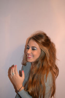
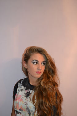
After looking at the images it became clear that these were not useful for use in my magazine. However they did allow me to improve on many things: clothing, posture, props, background light, makeup and hair.
The clothing in these photos were too casual. They did not represent the sort of clothing I found in my research of the Indie Rock genre. The grey top was not the right colour and the maroon playsuit and the flowery dress did not suit the genre at all.
The posture in these images were not right, the model had her body turned away from the camera most of the time which does not look right. Not having the model looking directly at the camera does not look very good as it does not draw attention to the model as a front page image must do.
Also the use of the hands doesn't look right as it looks as if it was awkwardly placed there. Again this does not represent the genre.
The use of props in these photographs were pointless as the prop does not look like it has anything to do with the genre of music the magazine offers. This rendered these images useless as the prop use may confuse the buyer about what sort of magazine they're buying.
The make up in these photos also looked tacky and too over the top. The makeup was also too colourful for the genre as I tried to create a colour theme that would link in well with the name of my magazine, Indigo.
 |  |  |
|---|---|---|
 |  |  |
 |  |  |
 |  |  |
 |  |  |
 |  |  |
 |  |  |
 |  |  |
 |
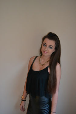
These were the second set of photographs I took. This time I used a different model.
The colour of the clothes in these pictures are more like the dark colours usually seen in the indie rock genre. The dark black eyeliner also matches the type commonly worn in this genre.
In these pictures I tried to use more relevant props which would inform the reader of the type of music my magazine would be promoting.
The model in these photos is still slightly tilting her body to the side however she is looking at the camera directly. These photographs however are not close enough as my research shows many females on music magazine front covers mainly only show their face in a close up shot.
 |  |  |
|---|---|---|
 |  |  |
 |  |  |
 |  |  |
 |  |
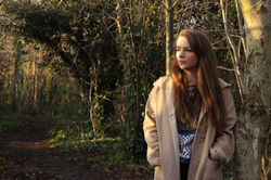
These are the 3rd set of photographs that I have taken and again I have used a different model. I have kept the makeup the same as it is dark eyeline which reflects the sort of makeup used by some Indie Rock artists.
In these photographs I have used my research to get photographs that represent my research. My research shows that female models usually have an extreme close up of their face as front cover images. The images that I would use for the front cover of my magazine are extreme close ups of the models face.
The clothing in these images represents the individualisticness of Indie Rock artists.