
Rhiannon Aylward
Media Studies
Front Page
Construction of the Front Page


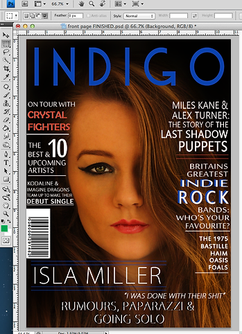

My front page background started off as this picture of my model. I had previously edited this photo. For my magazine I wanted a dark background in order to follow the theme of my genre of music, Indie Rock. I filled in the background using the brush tool.
I was then able to change the size of the brush aswell as the hardness. I chose a relatively small sized brush for better control and a medium hardness to allow it to flow easier.
I then changed the opacity from 100% to 88% as it allowed me to give the sadow look that I was going for.


To change the colour to black I had to click on the forward most white square. This gives you the colour picker option box.
I then changed the colour from white to black. This meant that I was now able to fill in my background image.
This was my front page after I had used the Brush tool in order to shade the background.
The next step was to add in the title. In order to do this I had to firstly type in the title of my magazine which was Indigo. The next step was to highlight this text and find the text that I had previously downloaded from Dafont.com.
The next step was to change the colour of the title. I chose a dark blue to represent popular colours from the Indie Rock genre. To change the colour I had to select the text colour picker. I did this by selecting the white square on the top tool bar whilst the text was highlighted. This brought up the colour picker.


This is what my front page looked like with the title placed.
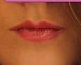
The next step was to add the cover lines into my magazine. I did this in the very same way that I added my title. I used various different text fonts in order to have variation of the front page. The majority of the writing is white however this is some blue as well as red which was the same colour as my models lips. I found this colour by highlighting the text and then clicking on the text colour box. I then clocked on my models lips and the colour was then copied to give me the exact colour.


The use of the blue from the title and the red from my models lips is used in order to show house style in this Indie Rock magazine.


These are a list of the fonts that I have used for each of the cover lines. All the fonts are relatively similar, they are all sans-serif fonts.

I also edited the writing so that some of the cover lines had bold font, whilst others were regular. Some of the font I stretched vertically and horizontally to give a different effect. The quote was in italics in an attempt to grab the readers attention and act as a lure. I did this by using the character tab on the right hand side.

Font selection
Size of the font
Tilt of the font
Height of the font
Raise the font
Font style
Height between lines
Width between letters
Width of the font
Colour of the font
Bold & Italics
Underline tool
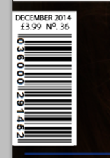
I created the barcode by importing one from my documents. I did this by going to File and then going down to Place. This then brought up my documents where I found the barcode that I had previously saved.
I then placed the barcode in the area of the magazine front page that I wanted it to go. I then added the date, cover price and issue number to the top of the barcode. I did this in the same way that I have added any text to my front page.
